Your Logo: Your Visual Handshake
Your logo is your first impression and badge of credibility. Create a mark that works everywhere so you can attract better clients, win more work, and outshine your competitors.

Have you ever walked into a house and could immediately tell it hadn’t evolved since the 1970s? Something about its layout, materials or color scheme was a dead giveaway that it was a relic from the past.
And at other times you were instantly blown away when you entered a modernized home, freshly updated with all the latest appliances and trends. It seemed to make the light brighter and the air sweeter. Same square footage - far superior experience.
You’ve heard the old saying, you never get a second chance to make a first impression.
A Strong Logo is Valuable
Most builders don’t understand how important, and still very relevant, a good logo is as part of their bigger business development ecosystem. It’s one of the most powerful tools in any builder’s business development arsenal, yet it often gets treated as an afterthought instead of the strategic asset it should be.
Your logo is not a decoration. It's your prospective customer’s first impression about your company, your badge of credibility. Your visual handshake before the conversation even begins. It instantly tells your story at a glance and makes a case as to why you’re the ideal partner to hire.
A Week Logo is a Liability
On the other hand, a weak logo can sour a prospective client’s image of you just as quickly. A clip-art icon or pixelated drawing, outdated text font or color scheme can instantly tank your credibility because it projects you as a small, careless, out-of-touch contractor - even if you’re not.
Meanwhile, your competitors may have invested in a logo that actually turns heads, inspires trust, and opens doors. It doesn’t matter how long you’ve been in business or how impressive your project portfolio is. They instantly appear more organized, skilled, and credible to the same prospect you’re both chasing. And in the end, that tips the scales in their favor.
Superficial, yes. But the market’s changed. Prospects today don’t hire on reputation alone. They Google you, check your social feeds, and make snap judgments based on what they see.
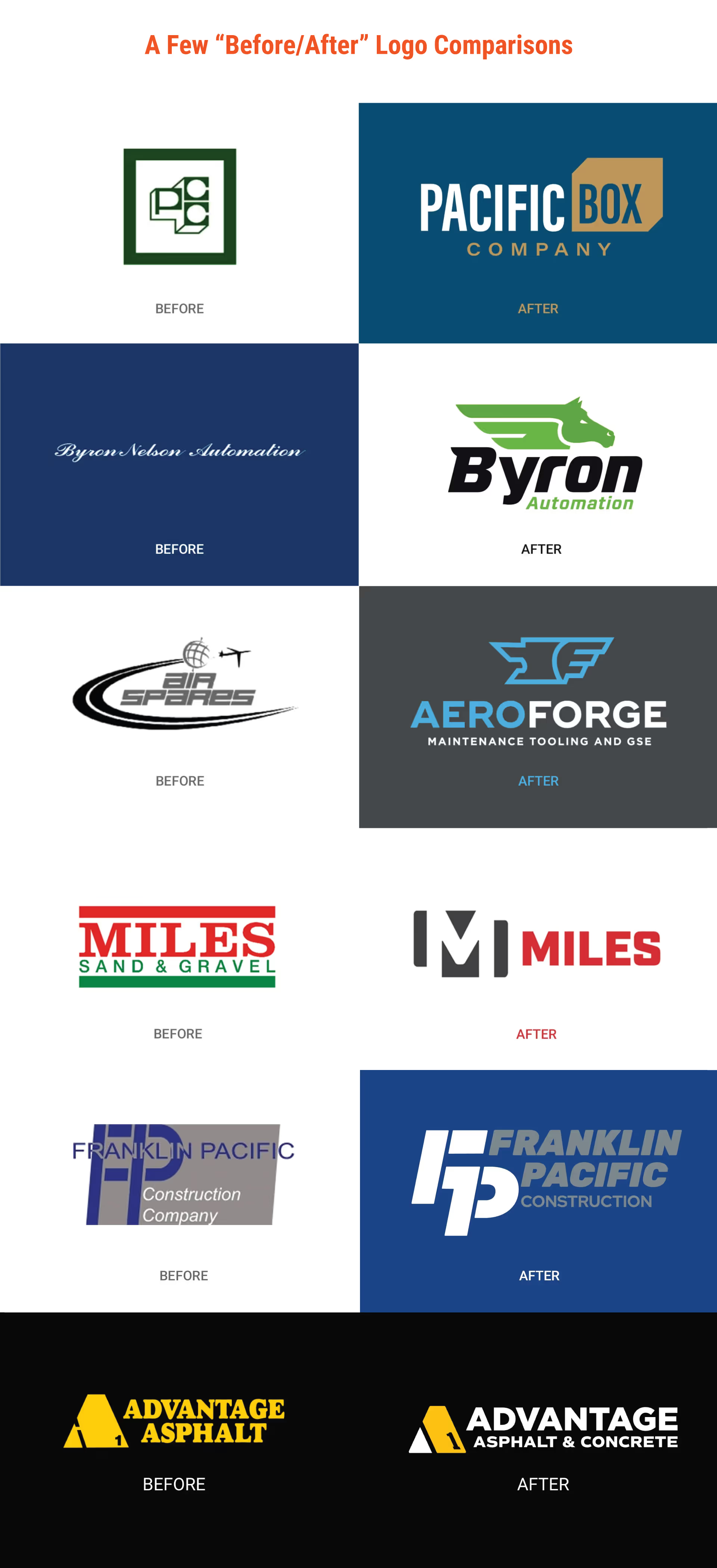
So, What Makes a Good Logo?
Your logo should be a simple, clear, and powerful expression of your value to your audience. It should convey your expertise, personality, vision, and story, all distilled into one unmistakable mark.
It can be an icon, an illustration, just text, or the combination of all three. It can be literal or abstract. Horizontal or vertical. It should be different from the other similar companies in your space and recognizable on everything from a site banner to a social media avatar.
Typography Matters
Also, typography matters. The font you choose is part of your voice. It tells people if you’re polished, rugged, innovative, or traditional. Serif fonts (with the little points on each letter) like Garamond or Palatino communicate longevity and intelligence. Sans serif fonts like Helvetica or Brandon Grotesque reflect strength and power.
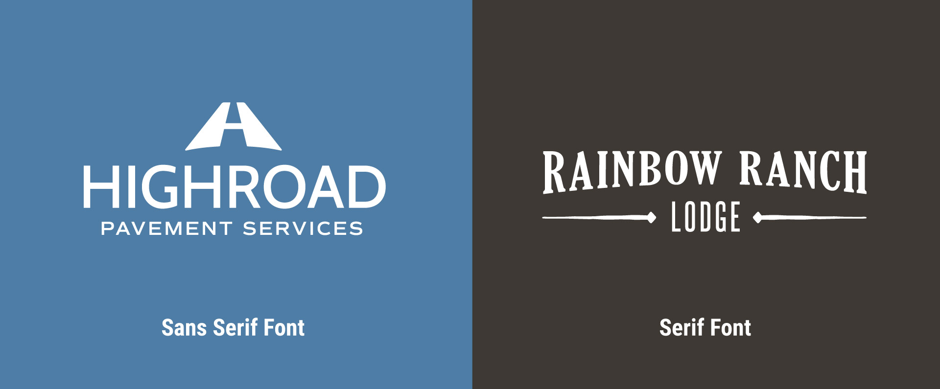
Avoid relics like Zaph Chancery or Comic Sans, or (egads!) Papyrus. Just like a 1970s home before remodeling, outdated fonts drag your image down by associating it with long-gone fads from decades past.
Color Plays an Important Part
Color choice matters too. Did you know why nearly 65% of all corporate colors are blue? Not because it’s always the perfect fit, but because it’s usually the “safe” choice everyone on the committee can agree on.
The right color should tell a powerful story about your personality, your passion, your values. Own your color and what it represents. Yellow is energy and optimism. Green can be about sustainability, but also luck and opportunity. Orange (our favorite) is bold, confident, and creative, and it works beautifully in the building industry.
A good logo also has to travel well. It needs to look sharp on a business card, a website, a social post, a crew hoodie, a hard hat, a billboard. Crisp, consistent, unmistakable no matter where it’s seen. That’s not just about style: it’s about memorability, recognizability and trust.
Now, let’s be clear: a great logo doesn’t guarantee success. But a bad one will hold you back. It creates friction. It makes your business look small-time. It makes people hesitate before calling.
Avoid the Usual Traps
When developing or refreshing your logo, avoid the usual traps.
Don’t use stock icons like rooftop silhouettes, hammer graphics or your regional landmark because they are everywhere. You have to think beyond the cliches. What animal or symbol could represent your team’s passion? The more unique it is, the more you can stand out from the crowd.
Don’t overcomplicate it with drop shadows, bevels, marble textures, and 3D effects that belong in a time capsule. If you can’t read it from the passenger seat of a pickup, it’s failing.
I use what I call the 5-inch, 5-foot, and 50-foot test. Your logo should be recognizable and readable at all three distances.
And do yourself a favor and invest time and funds into your logo. This is your company’s face. Don’t hand it over to AI tools or gig workers on Fiverr.com who know nothing about your industry.
Yes, AI can spit out a logo in ten minutes. Gig workers are cheap. But they don’t know you or how to differentiate you from the others in your space. They don’t know your reputation, your team culture, or the problems you solve better than anyone else. They don’t know what will make your ideal customer trust you.
A logo from AI is just a picture. A logo from a thoughtful process is a brand.
Your Visual Handshake
If you invest time, energy and resources into developing a professional brand and logo, it will tell the world, “We take pride in what we do.” When you get it right, it gives you confidence. It makes it easier to put yourself out there, show up in more places, attract better talent, win better jobs. And it makes the people hiring you feel good about choosing you over your competitors when it's time to green light that next big project.
Your logo is your first impression and badge of credibility. Create a mark that works everywhere so you can attract better clients, win more work, and outshine your competitors.
In a hurry and don't have time to read? Listen to podcast on Apple Podcasts, Spotify or Soundcloud.

Written by Rusty George, with no help from Artificial Intelligence. Well, maybe he used one little app to check his grammar from time to time, but hey - he's only human.
Rusty George leads a branding, website design and marketing agency serving Seattle and Tacoma area construction companies, subcontractors, manufacturers, material fabricators and suppliers. His goal is to help the building industry become more attractive to the skilled workforce of the future. Reach out to us at any time to discuss how developing a strong logo will give you the edge in the building industry.
MORE Insights
Unlock the secrets to transforming your construction company into a marketing powerhouse with Louder Builder.
Social Media For Builders
Why Builders Should Start a Video Library Today
SIGN UP FOR UPDATES
We will send you our latest insights from Louder Builder as they are released.
CONTACT US
Are you ready to begin your project today? Just have a few questions?
Either way, let’s talk.
